


The room I made: nursery design fun
Creating my daughter's bedroom and being let loose with all sorts of cuteness

As I write, I am sitting in the rocking chair in my daughter’s nursery. Firstly because I came in here to look around the room to refresh my memory of what we did to get the finished look, and secondly because I have spent so much time over the last year sitting in this very spot, I figured why not add to the time tally. At least it’s a more sociable daytime hour, not somewhere between 3 and 5am – thank heavens for sleeping through (you will get there if you’re reading this in despair and I am 100% all too nervous about putting that in writing for fear of some awful sleep regression or the like!).
It has been a little while since we completed the decorating of the nursery, I admit. It was the second room to be done quickly after we moved in last year – I was seven months pregnant when we moved so the time was ticking. And I knew I wanted to have the experience of putting together a nursery before the baby arrived despite knowing he or she wouldn’t sleep in it for the first six months. Call it nesting or whatever, but I loved the fun process of putting this space together, from deciding on a gender-neutral theme (we didn’t know what we were having) to getting the practical stuff and the accessories just right.
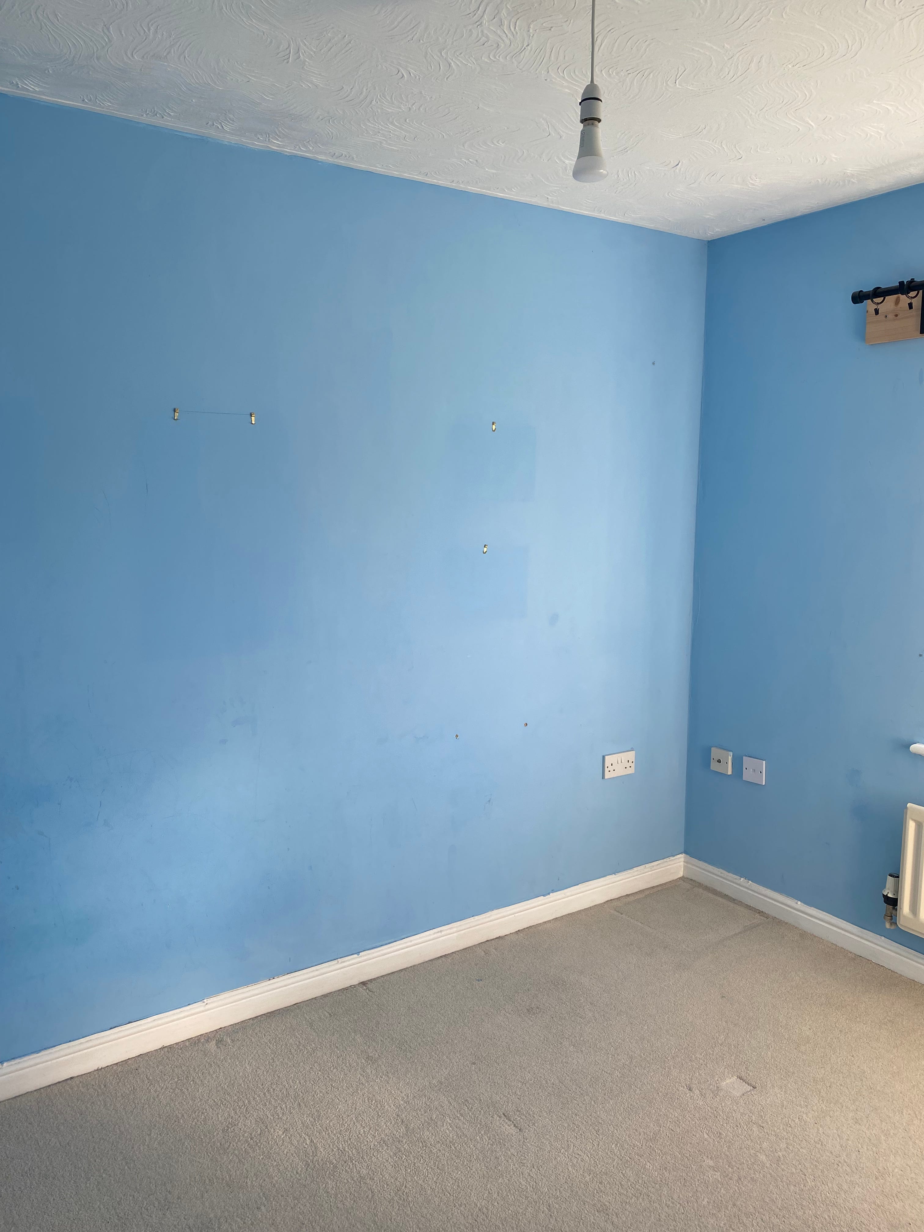
The space had been used as a little boy’s room by the previous owners so was painted blue (like most of the house) and had a beige carpet already in place. Other than that, a blank canvas. Storage-wise, there’s a large fitted cupboard (so useful) and there’s one window. It’s the second largest bedroom so while not huge, an adequate space to get in what we needed, and what I wanted (i.e the fun stuff!).
I began on Pinterest (natch) and quickly had many a browser window open with various shopping baskets filled with various cute things. At first, my pins were largely of what I like to call ‘sophisticated’ nurseries – you know those muted toned, dusky pastel adorned, wooden accessories, veiled cots and teepees against a beautiful botanical wallpaper. Think Shea McGee’s gorgeous creation for her daughter Margot and you get the picture. I do love this vibe, but you know what, when I put the moodboard together and pinned wallpaper samples to the wall, it just didn’t seem quite right. Super stylish, yes, but something didn’t sit right. It was actually the SO who said it looked too grown up and he was right (begrudgingly, of course). “It doesn’t look like a baby room,” he said and I had to agree – although the idea is banked for when she’s a little older.
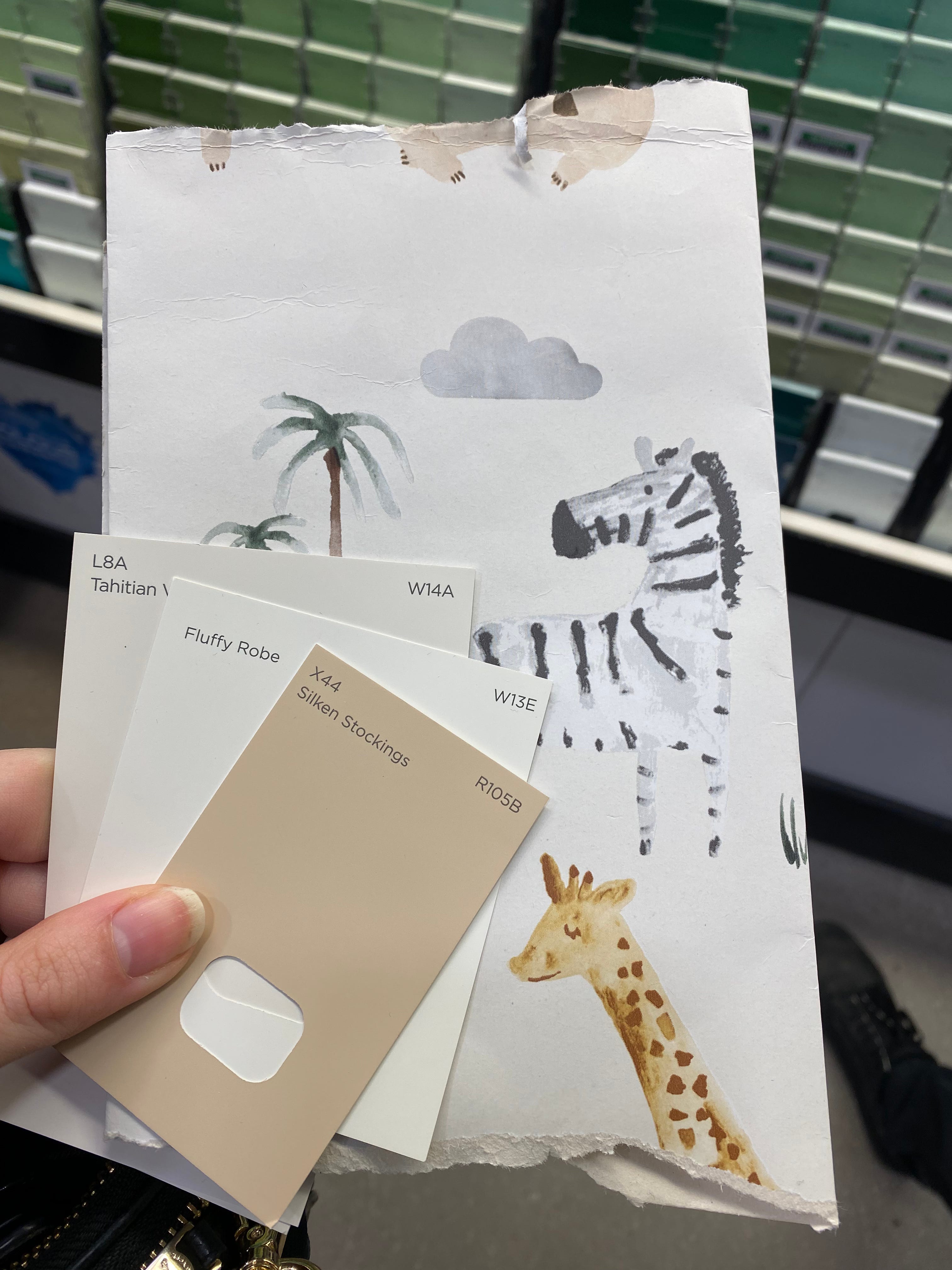
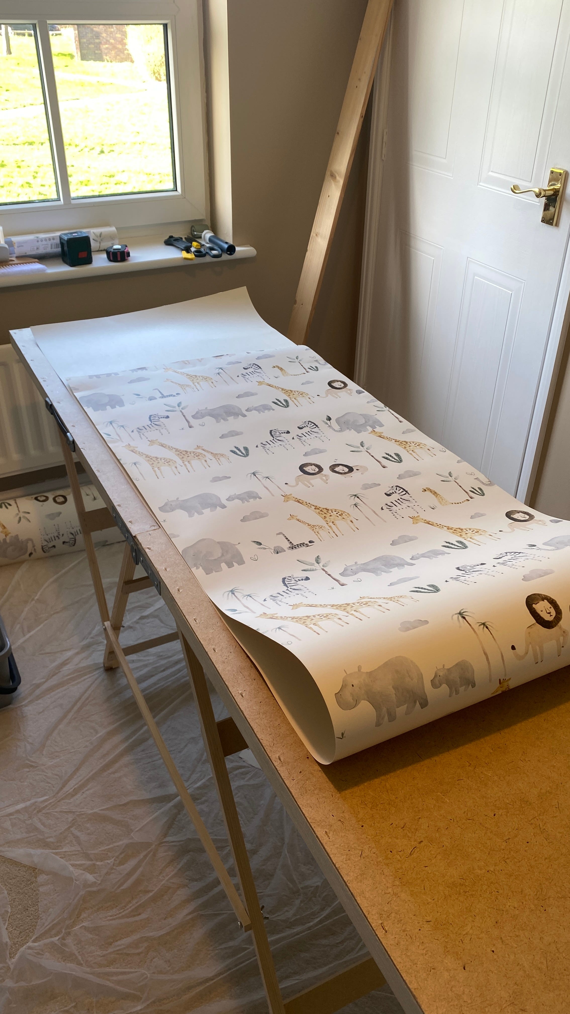
Back to the drawing board, I started looked at the ‘kids’ section’ for wallpaper as I knew I wanted one feature wall – the one you see from the hall – and the rest of the walls painted in a two-tone half-and-half effect in coordinating colours. What I found when searching for child-appropriate wallpaper was that there are very defined camps: characters, cartoon-ish designs, typical pink and blues, clouds and rainbows, space and dinosaurs. By this point, I had narrowed down a theme to safari and wanted a more illustrative design rather than cartoon lions and tigers and bears (oh my!) (I know bears aren’t safari, btw).
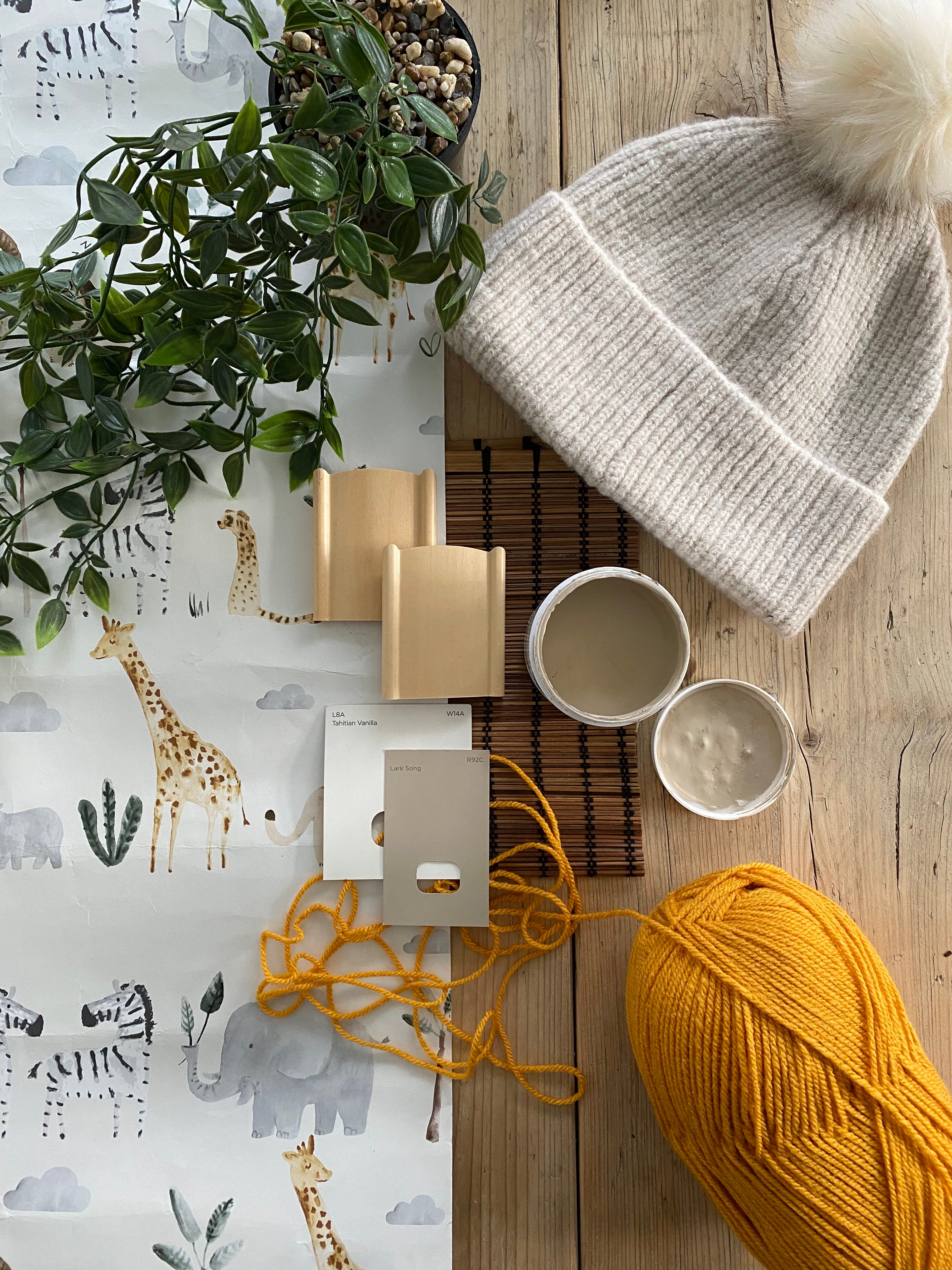
Samples from various shops in hand, I put them up and kept going in and out of the room until the winner was clear – a delicate watercolour-esque wallpaper from Dunelm, which I really rate for their wallpapers incidentally. And it was a tenner a roll so a total bargain.
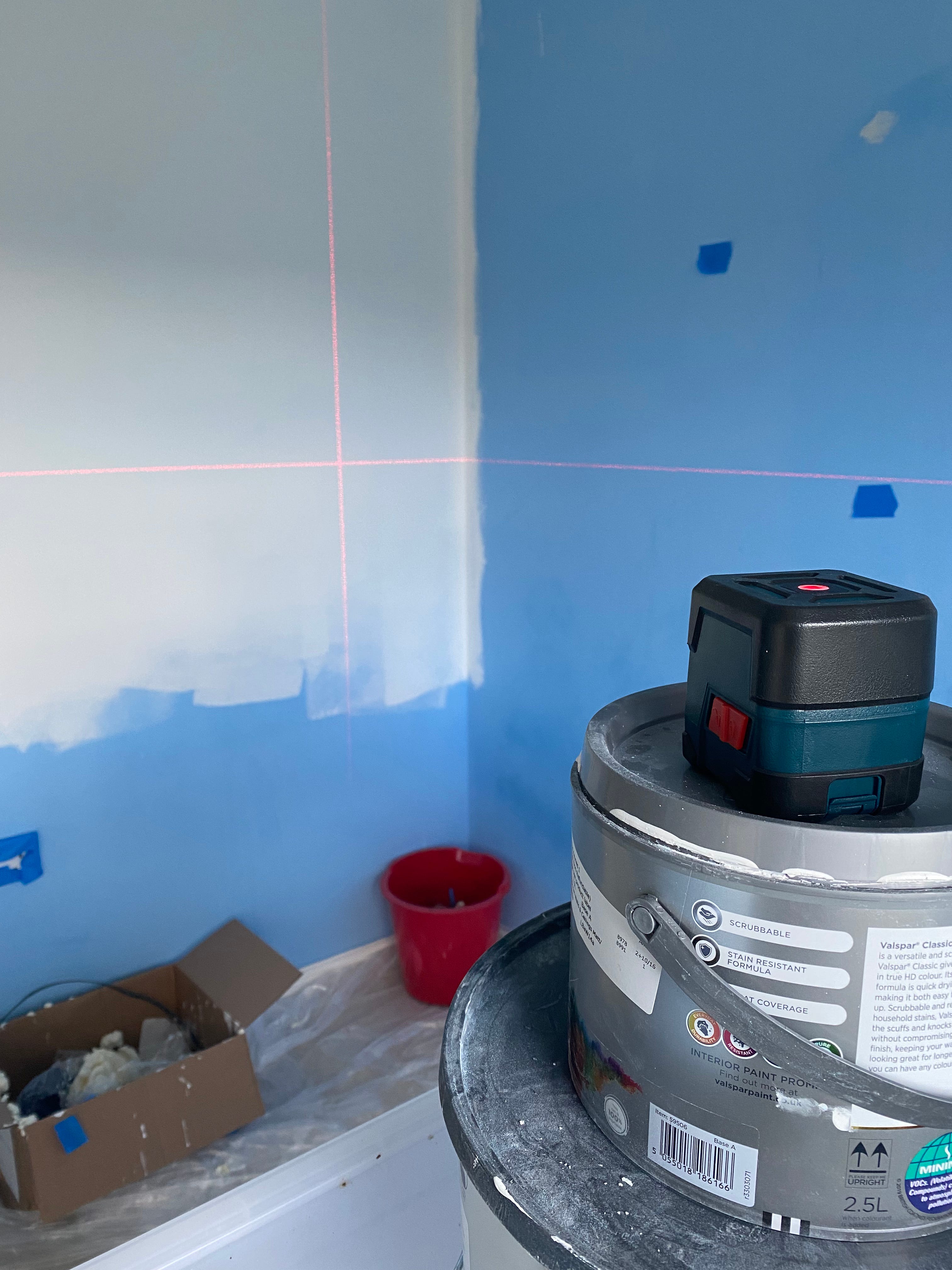
From there, I could decide on which paint colours to use for the two-tone walls. I took the wallpaper swatch to the Valspar counter at my local B&Q and found Tahitian Vanilla for the off-white top half and a warm sandy tone for the bottom called Lark Song. To achieve this, we bought a clever laser rule and decided on where the split should be (slightly off the half-way point with the bottom half larger than the top), masked it off and began with the lighter top half. And then I handed over the decorating reins while I shopped some more.
Since the built-in wardrobe provides a great amount of storage space, a changing table atop a chest of drawers was a practical dual-purpose addition, with two floating shelves for soft toys and books and a peg rail for hanging baskets for cotton wool, reusable wipes and clothes. The cot and changing table set in light oak came from Mamas & Papas (the Atlas range) and the shelves were another Dunelm purchase. A friend (now affectionately known as Del Boy) was getting rid of lots of baby stuff, so she sold me the rocking chair for a pinch and even though I’d been eyeing up more design-led, but far less practical options, I can absolutely confirm that this is the best chair for late-night comfort and endless feeding sessions. The cost per use is pennies.
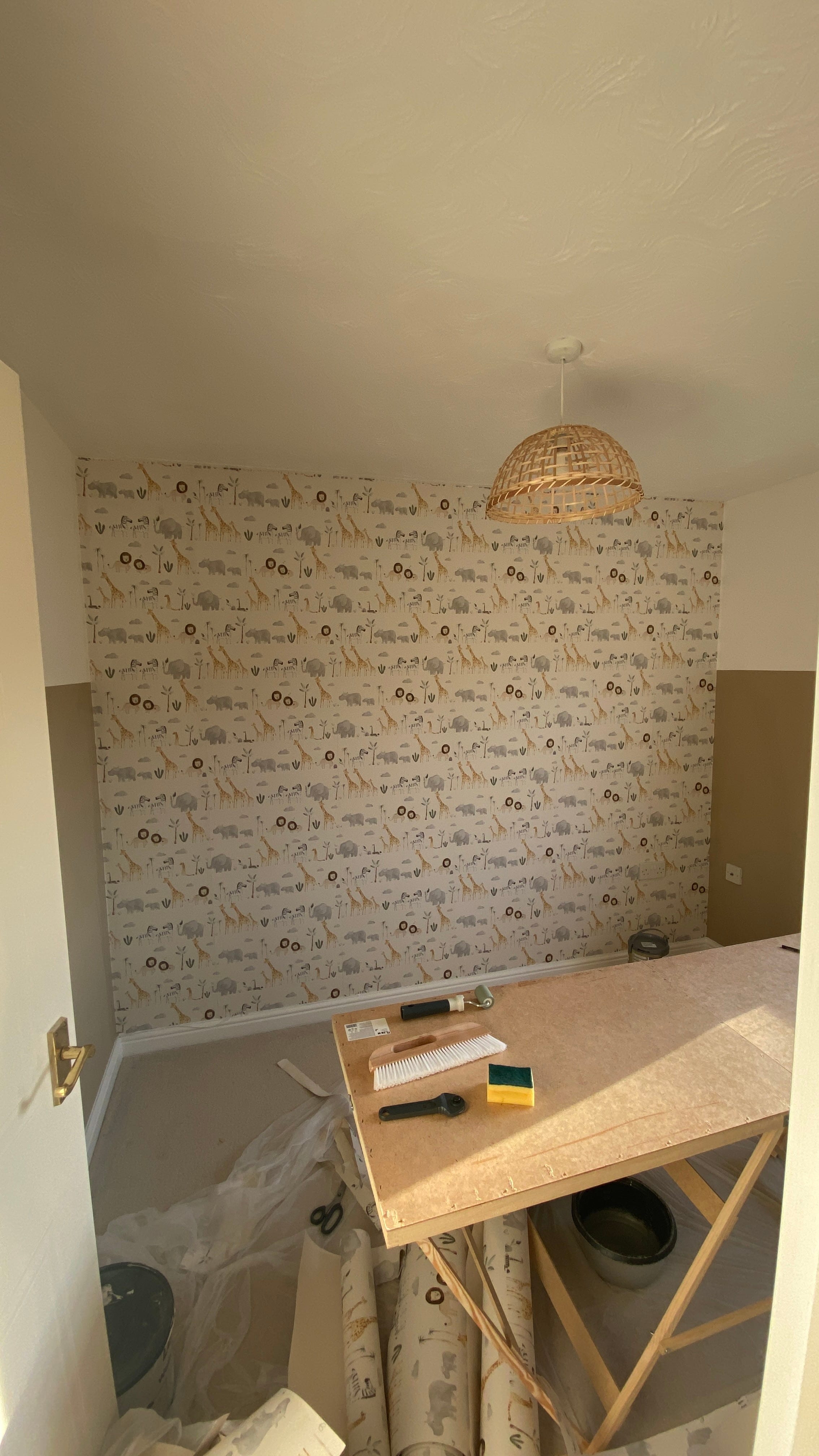
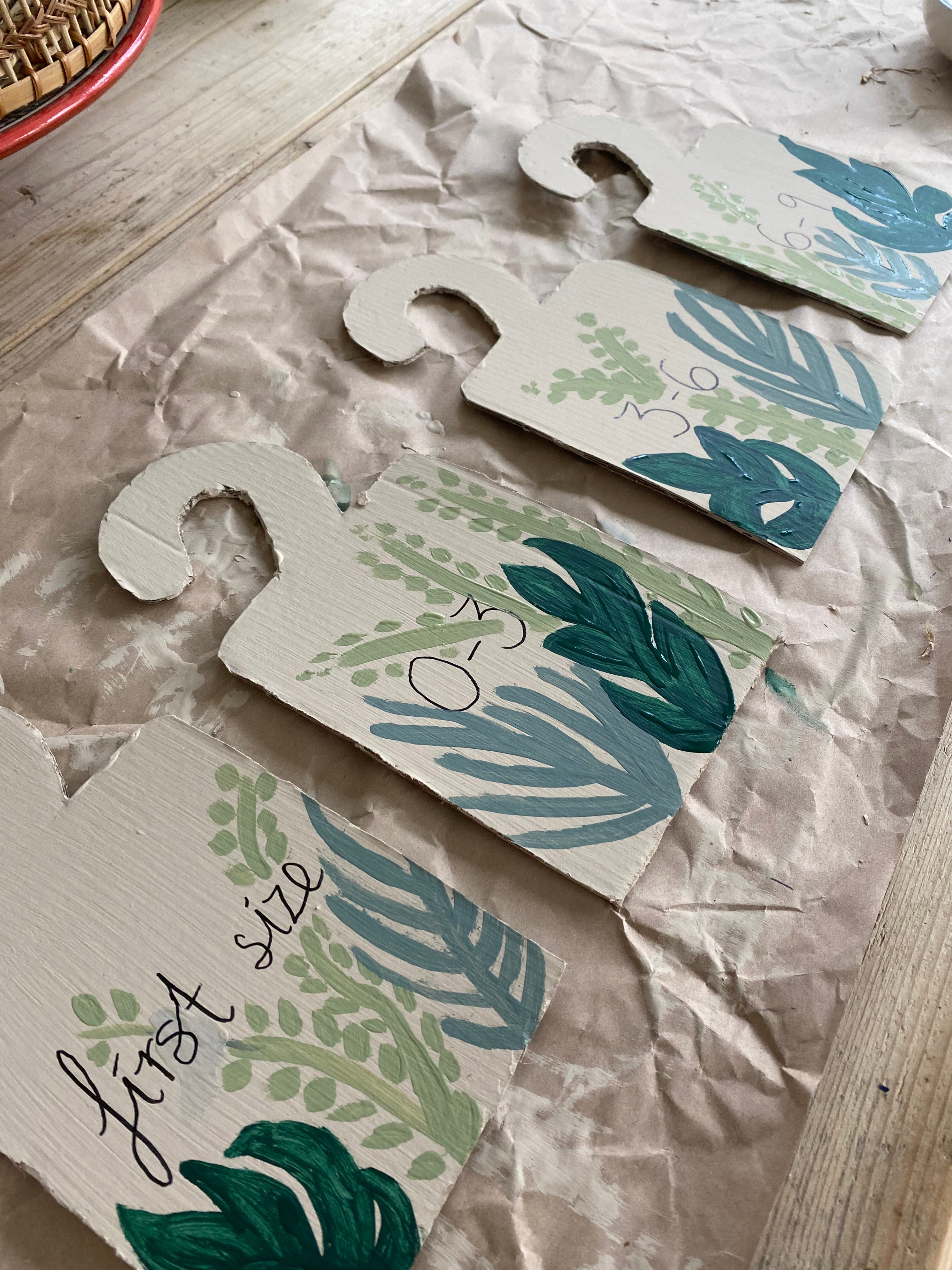
Once the wallpapering and painting were done, the excitement really kicked in. The blue room had been totally transformed, felt much warmer and more inviting, and perfect for either a boy or a girl. The furniture had already been delivered and was lying in wait, so that was built and then I could be let loose with accessorising and organising, even making some wardrobe age/size dividers with some of the mass of cardboard and leftover paint tester pots from the living room project.
I put a faux sheepskin rug at the foot of the chair, which turned out to be a great idea as it feels so nice under your feet and that’s just the luxury you need in the middle of the night. I added some faux plants (on high shelves out of reach), art prints, ornaments and a lovely keepsakes box received as a gift. Teddies found their perches and slowly drawers were stocked with nappies, wipes, muslins and all the essentials. And then, of course, spent the rest of my pregnancy faffing with it all. I’d regularly be ‘caught red handed’ just spending time in the room for no particular reason.


Now, more than a year on from finishing the room and one year on from my daughter’s arrival – she turned one this week and it’s her party today, in fact – there are some things I have learned to improve the design for longevity. Firstly, while that peg rail with baskets on looks nice and was very practical at first, it’s now a play zone for pulling baskets down and pouring their contents all over the changing table and floor at every opportunity. The shelving is high so good for decorative pieces, but not for little miss reaching books and toys, so we need to add some lower-level storage. I’ve decided where the chair is will become either a play zone or spot for a teepee, which later will likely be a desk space as she grows, so if you’re designing a child’s room, it’s worth thinking about what the spaces will be used for as needs change.
Reminiscing on creating the nursery brings a big smile to my face. Kids’ rooms are such fun spaces to create and when you’re expecting, it’s a mixture of decorating excitement and things getting ‘real’ in that there’ll soon be a tiny person to call the room theirs – or at least that’s how I felt about it. And just like her wildlife-inspired nursery, my daughter’s first birthday party is safari themed with all sorts of ‘Wild One’ paraphernalia that I couldn’t resist buying on Etsy. She’s been walking since she was 10 months old so the wild theme is befitting all round, let me tell you. Maybe it was the décor that spurred her on?