

The Devil Wears Prada 2: Interior highlights you can shop
Indulge me for a second. That's all.

I got into magazine journalism because of the film How To Lose A Guy In 10 Days. True story.
Andie Anderson, aka Kate Hudson strutting around New York City in pursuit of the story (and man, aka Benjamin Berry aka Matthew McConaughey, yes I Googled the spelling) lit a fire in me that told me ‘this is what you’ll do’. Not exactly chase a story/man per se, but the lure of those glossy magazine pages, the creative ideas and creative do-ing, the fun and the camaraderie.
So obviously, like so many others, The Devil Wears Prada is also a key cultural moment in my formative years. I loved the first film when it came out in 2006, have watched it 1046583 times since and had such a fun, girly day out last weekend when I went to see the much-anticipated sequel, The Devil Wears Prada 2.
I could wax lyrical about the plot (accurate representation of journalism, sob), how it stayed true to its identity without becoming cliche, and the clothes (THE CLOTHES!), but I loved looking at the interiors too.
While the journalism context of the film from one to two, spanning 20 years, has changed dramatically, the interiors really haven’t that much. The office is bigger, yes, and the furnishings have had an update, but the overall look felt familiar. It is considered, style-led but timeless, muted but with exquisite detailing to elevate. Very quiet luxury.
The notable differences I spotted were that the 2026 film’s interiors are softer, more inviting, homelier. Think curved sofas, tactile boucle, convivial seating, warm wooden accents over metal, acrylic and glass furniture, typical ‘office’ designs - i.e swivel chairs - and an arguably colder monochrome treatment which were much more aux fait with the Noughties.
“The first set was pretty contained and only suggested a larger space,” production designer Jess Gonchor told House & Garden…“It’s not like I wanted to fix anything [from the first film set], I had just matured in a massive way.”
While watching the story unfold and naturally being wowed by the amazing wardrobe coming out of the Runway fashion cupboard (faves include the tweed/check a-line dress towards the end and that Hamptons dress – gorge), the key pieces making up the interiors set created the perfect backdrop to the drama. And so I, of course, wanted to search out some similars.
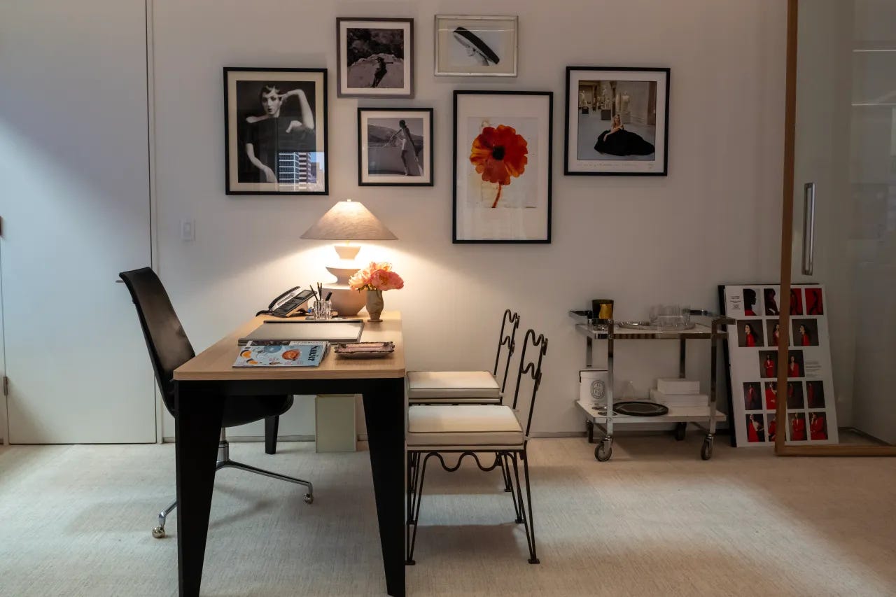
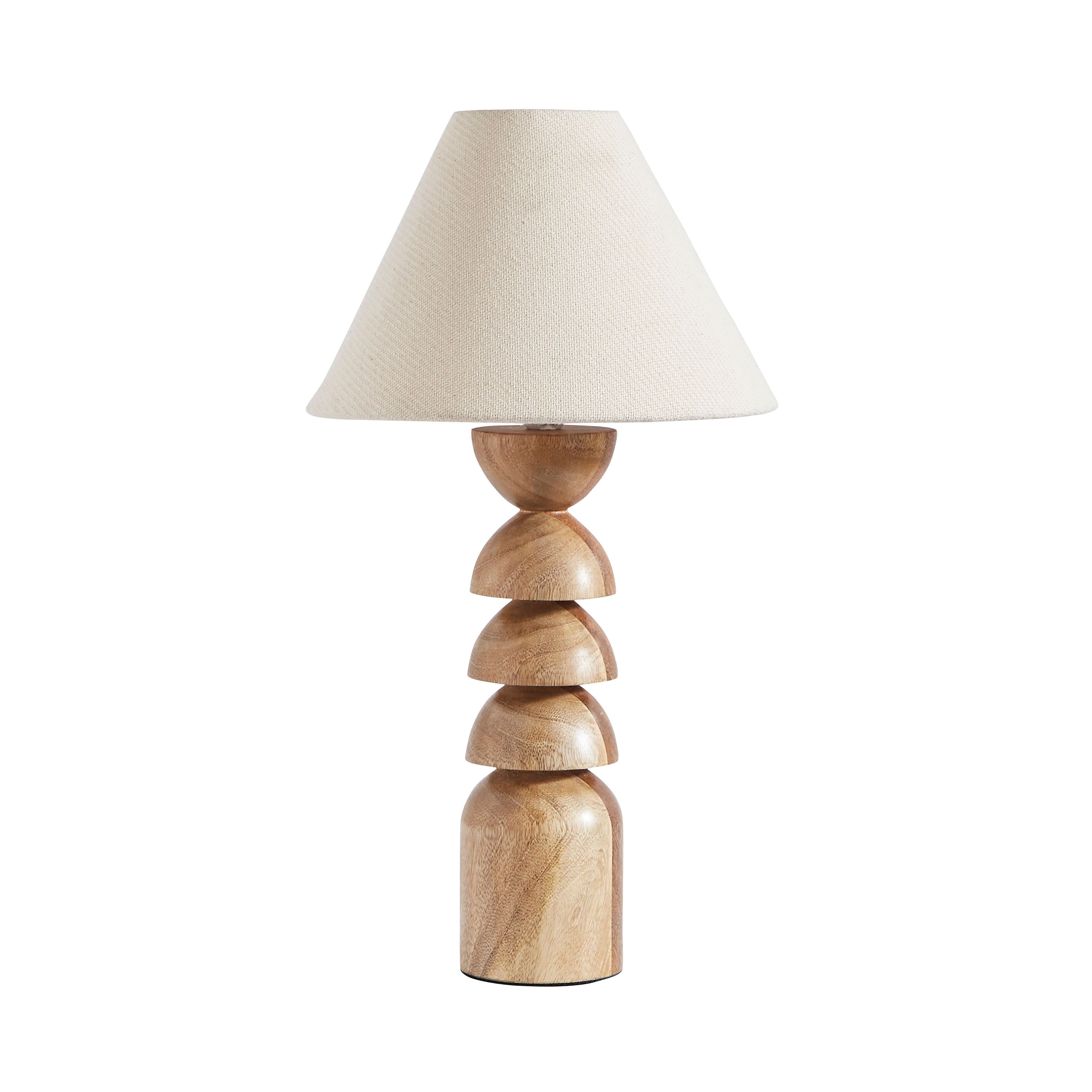
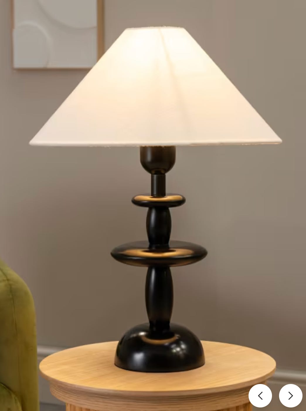
The lamp on Miranda Priestley’s desk is a stacked conical design. It’s a shape I am seeing across many lighting brands and looks great as a single or doubled up as bedside table options or either side of a large sideboard, for example. Stacked styles seem to be having a bit of a moment across lighting including lamps as well as wall lights and pendants and I’ve seen some fun colourful options like this glass one from Pooky or a striking stone option from Lights.co.uk.
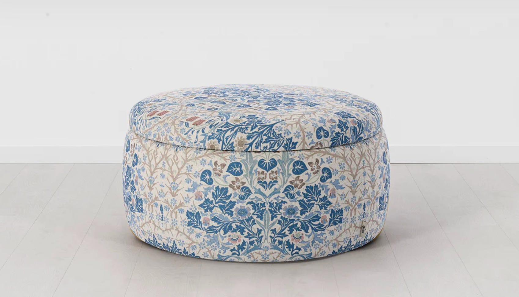
Another spot from the editor in chief office was a really lovely blue and white chinoiserie-style pouffe. Possibly even in a cerulean but that is me guessing and quietly hoping at the subliminal humour and nod to the first movie. Don’t quote me on it. I imagine it being used as a perch for a team member when all other seats in an editorial meeting are taken, or perhaps a rest for tired Manolo Blahnik-adorned feet.
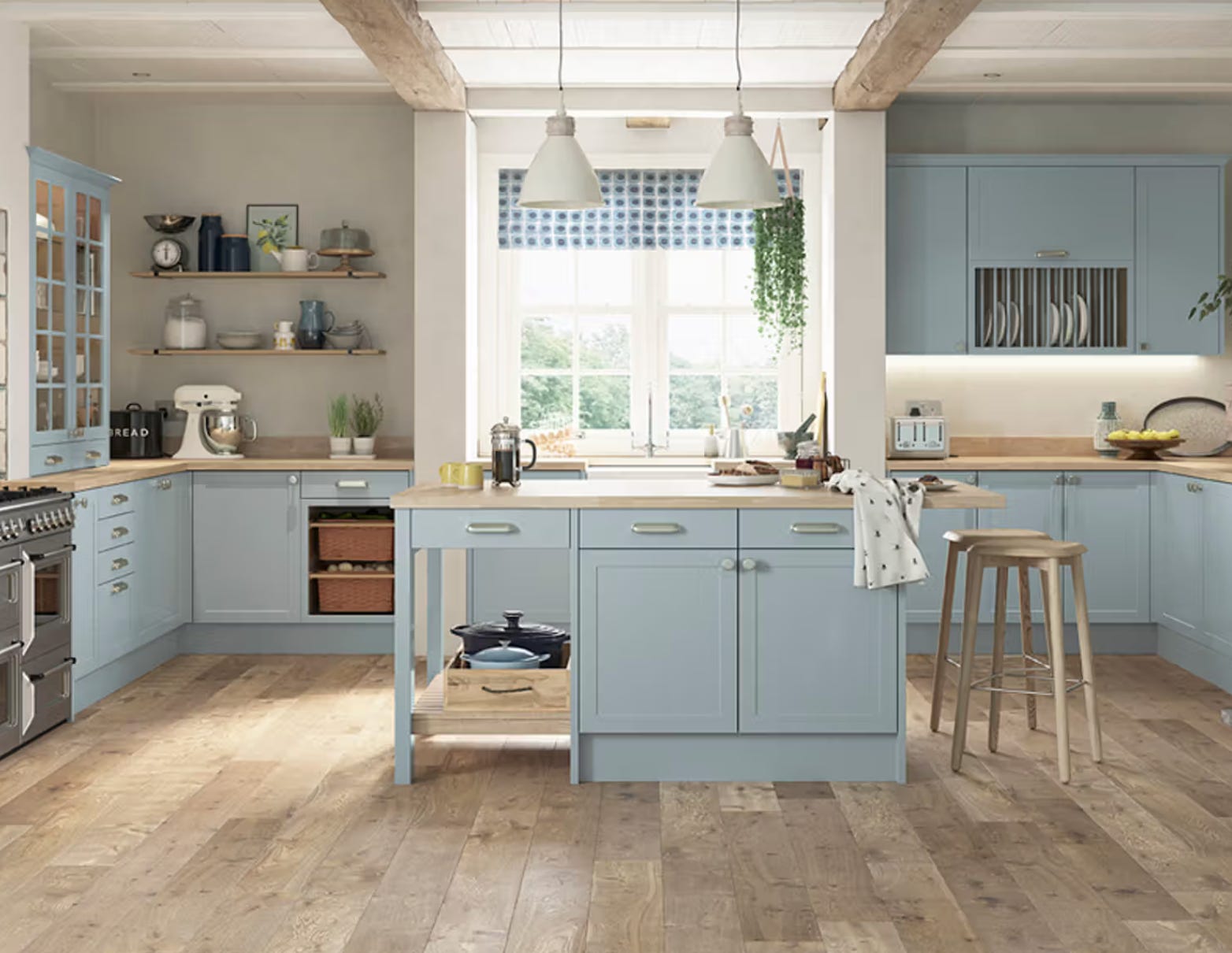
I mentioned that dreamy dress Andy aka Anne Hathaway wore to the Hamptons but can I also talk about the kitchen in the Long Island home. It’s a soft, painted wooden kitchen with a light, airy and distinctly relaxed vibe. This style of kitchen reminds me of Plain English, Neptune or Devol but I also spotted Magnet’s Dunham kitchen in a new colourway, Cornish Clay. The restrained colour palette, limited wall units and natural, almost rustic look provides a calm antidote to busy NYC life and perhaps unveils a softer side to Miranda too. The sea air will do that to you, I suppose
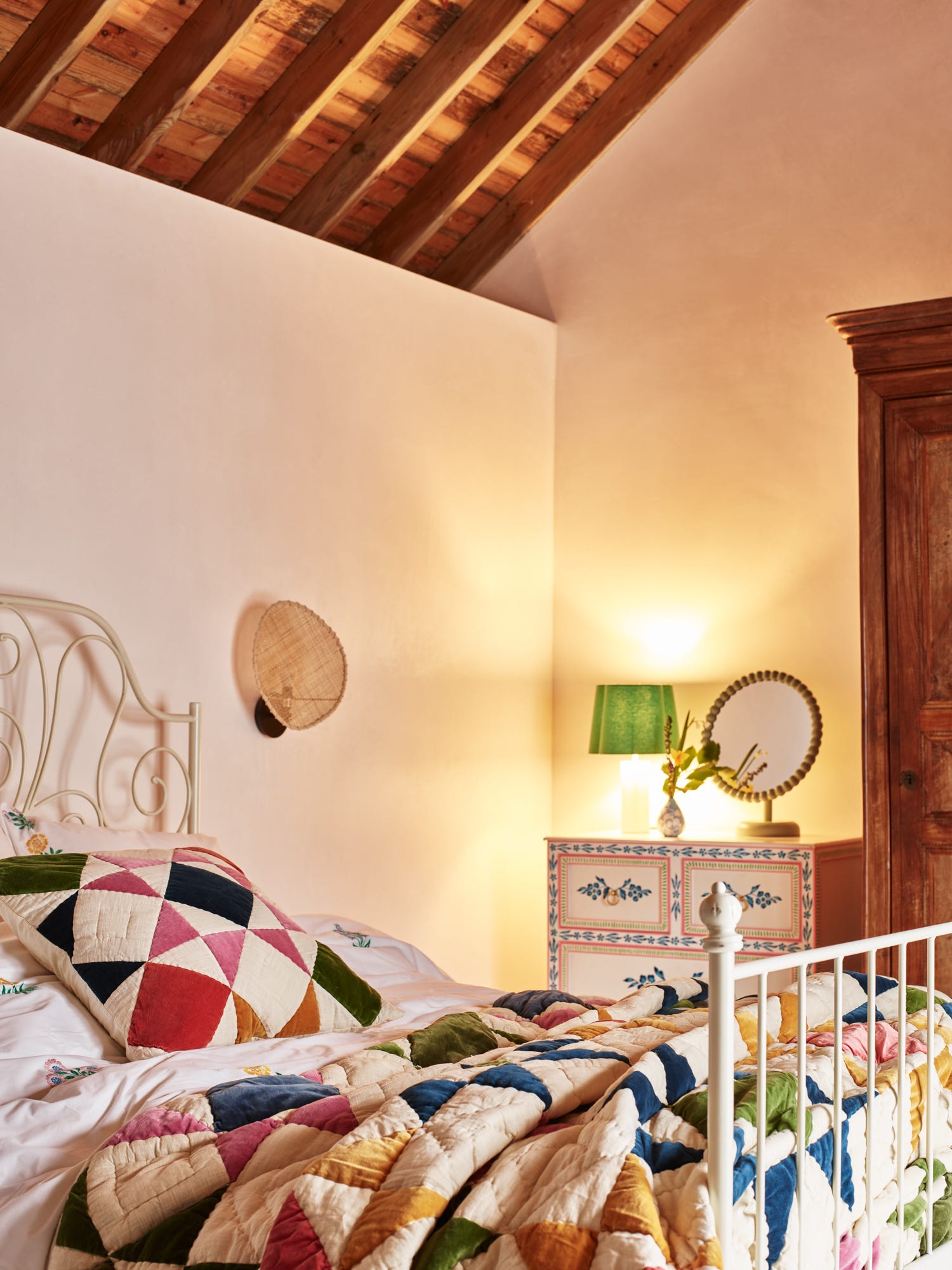
Not forgetting the Hamptons patchwork dress, though. As a little nod to its design, what about the Patchwork multi-colour velvet cushion from Oliver Bonas (below)? I have this already and it lives downstairs on my sofa but I have also had my eye on the throw for some time.
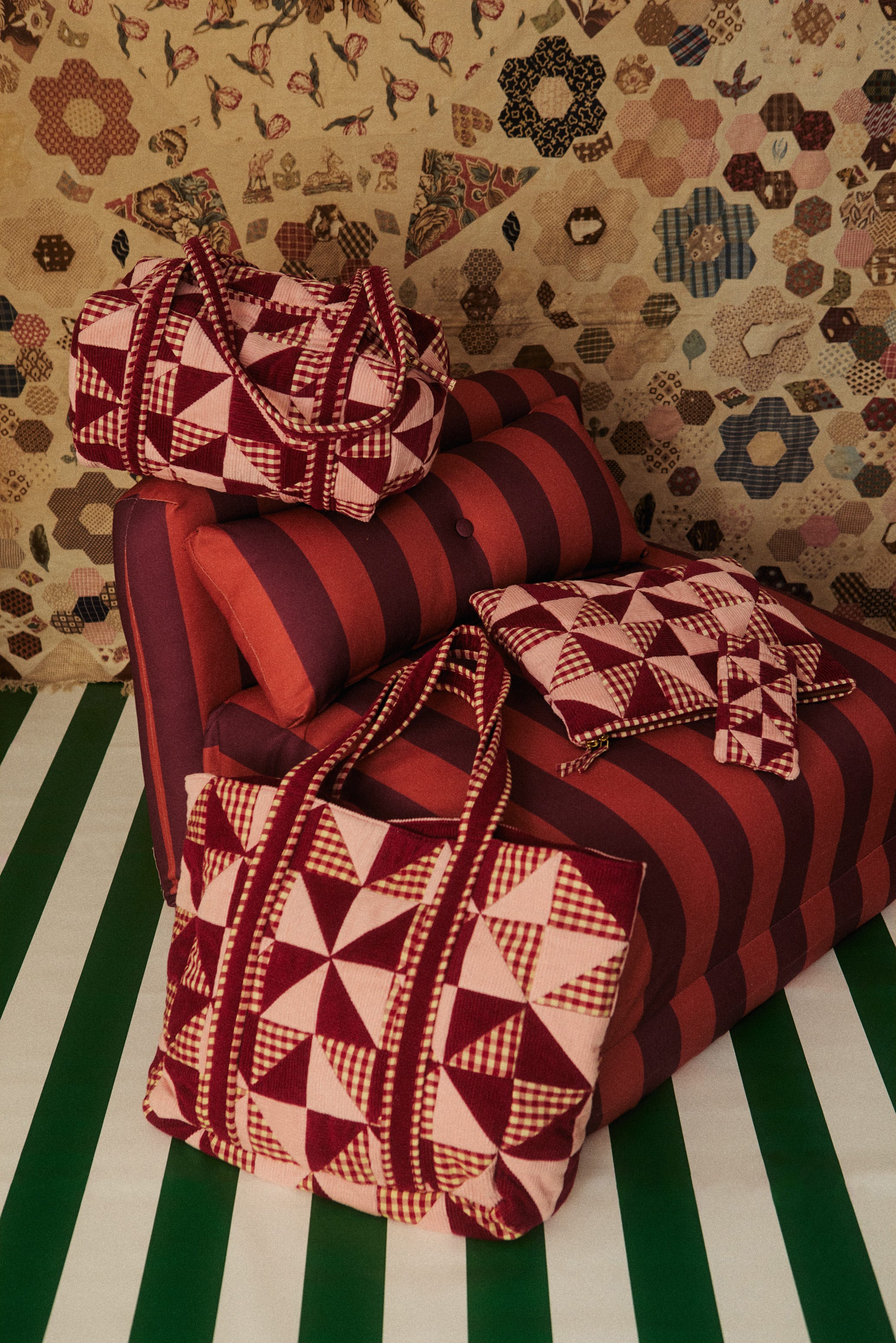
A part of the plot and the evolution of Andy centres around her finding a new place to live, and in turn, a new love interest. She moves from a small apartment with disgusting brown water coming from the taps to a spacious, open-plan abode that is the ideal backdrop for her collection of vintage knick knacks and high-low pieces. Andy’s artist friend Lily’s loft apartment appears early in the film and oh boy it’s a beauty. I wish I could find a picture of it, but I can’t so another trip to the cinema may have to happen to indulge in it again. Basically, think very cool loft space with brick, metal, art, designer furniture and you’re there.
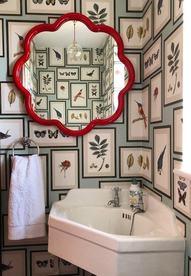
Red features throughout the film. It’s part of the brand. There’s a vibrant red wall with rows of past magazine covers displayed by the writers’ desks, art prints on Miranda’s office gallery wall feature red accents and there are even feature moodboards propped up with what looks to be a focus on the colour.
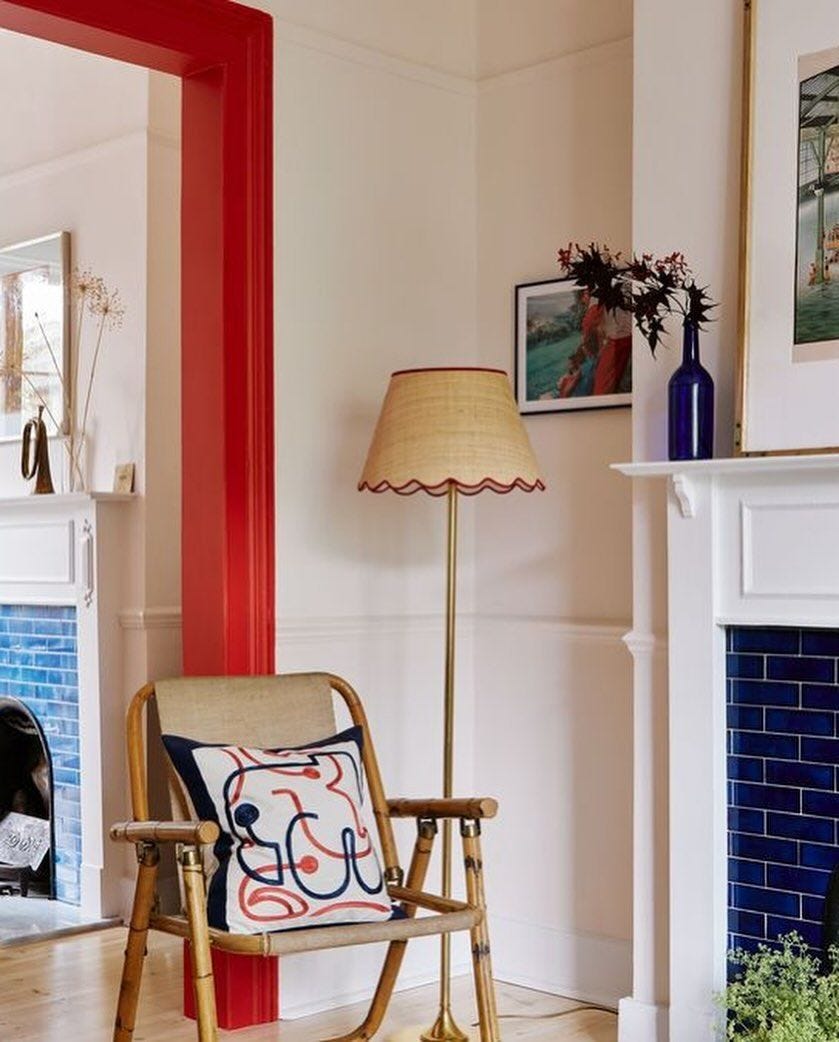
Despite not being ‘a thing’ when the 2006 film aired, there’s now the notion of the unexpected red theory - something the interior styling folk will tell you is a clever little trick. Essentially, it’s placing a red item - big or small - within a scheme as an accent that, surprisingly, does work. It can be as tiny as a vase or as part of a striped cushion design, a trim on a curtain or blind or, for the kitchen, a casserole pot on an open shelf, or a pepper mill. The idea is it gives a dose of energy to a room and helps pull a scheme together, even if you wouldn’t naturally think to put something red in it.
Tell me, have you seen the film? Thoughts? Favourite interior or fashion spots? Continue to indulge me in the comments.
P.s if you haven’t already, Google ‘devil wears prada 2 movie’ for something fun.
Chat soon,
Lindsay