


For the love of terracotta
I just can't get enough

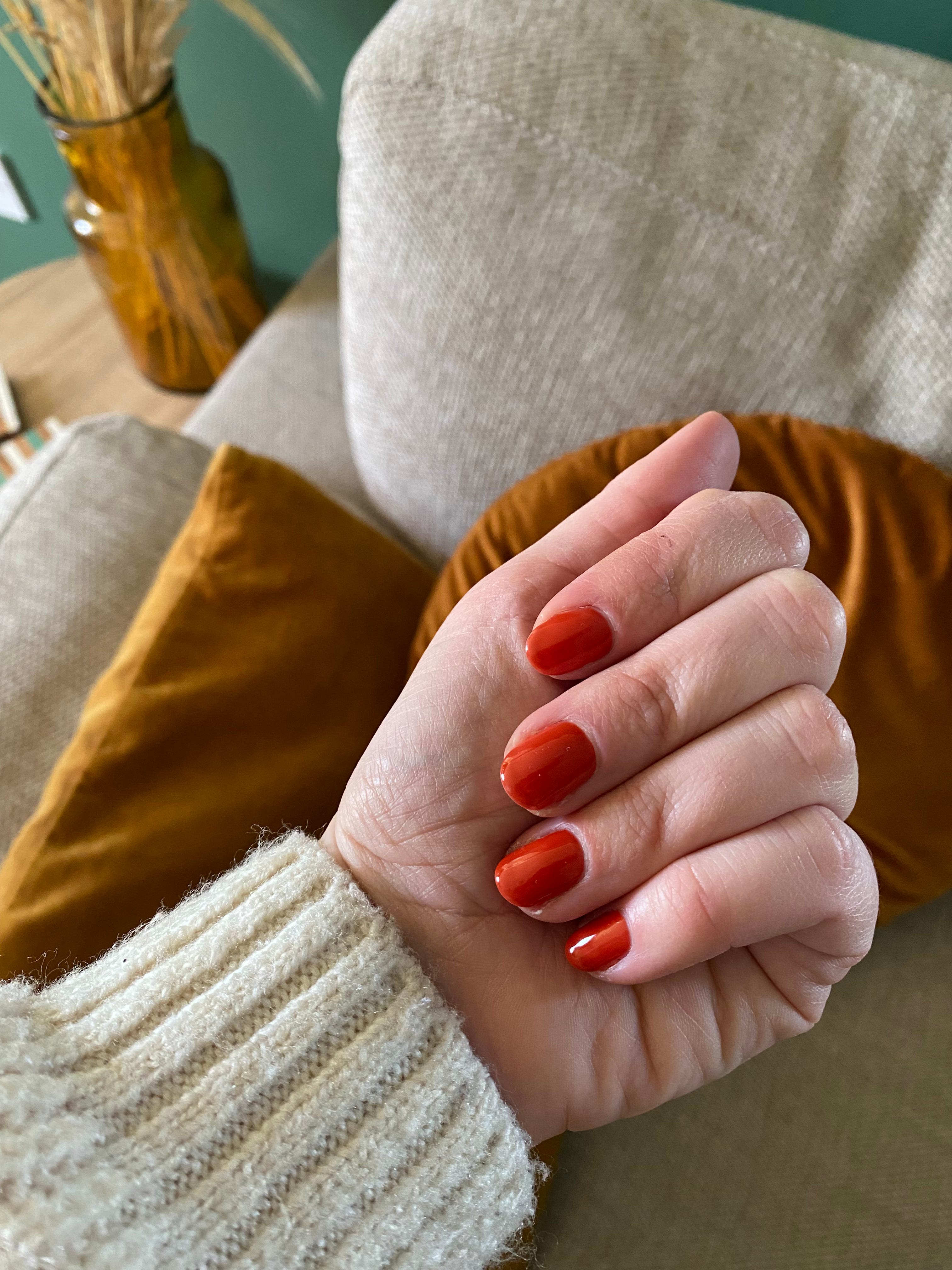
It was when I walked out of the nail salon earlier this week that it hit me. I looked down at my freshly gelled mani and realised: I’ve got this thing with terracotta. My nail colour of choice a sure sign that my affinity to this shade has reached a new level.
I remember a few years ago, I wrote in my then editor’s letter about this ‘new’ colour that was starting to make waves in interiors. I already loved it, as I tend to do with many of the earthy tones (I’m an autumn girl, what can I say?). Then terracotta started cropping up more and more, with browns becoming a luxe shade of choice for bathrooms (yes, really) and heavily veined marble worktops, as just two examples.
For me, it’s the richness of the hue that I like. And, while some may think it is statement, it’s surprisingly versatile. It looks great alongside a palette of black black, white and greys, where it adds a much-needed dose of warmth. And it also works well alongside other jewel tones like a rich teal or deep green. And of course, those earthy shades found in nature always work in harmony together in interiors.
I began introducing terracotta into my home through the somewhat obvious choice – pots, both inside and out. Then, it crept further inside thought artwork, cushions, decorative items and culminated in painting a feature wall and inside of an archway in the dining area/kitchen in the shade. In the living room, highlights of terracotta feature in cushions and other accessories, sitting against a dark green backdrop, while in the other areas of the downstairs where the colour is used in higher doses, black and grey for more of an accent and to cut through the warm shade to keep it modern. Although, I love the idea of introducing a teal sofa against the feature wall to really play into a jewel-toned palette.
Since I’m now fully immersed in my obsession for terracotta, I’m very much enjoying seeing the colour feature in new collections being launched into spring and likely beyond. I’ve collected some of my favourite images for inspiration of how to use the colour, so let’s take a look together…
First, this lovely shot from Furniture Village, combining terracotta paint and matching panelling with a deep blue sofa and matt black lighting. The key is to keep other colours on the warm side of the scale, I think, like the sofa which looks nice and inviting. Hot pink wouldn’t be my personal choice to feature in this palette, but it’s a great way of showing off just how versatile this backdrop colour is.
I love affordable high street buys to introduce a small dose of a trend into a space. If a teeny touch of terracotta is all you fancy, a wavy edge cushion could be just the ticket, like this one from George Home.
If you’re invested in my quest for bedside tables (see here if you have no idea what I’m on about), I have added this beautiful set of nesting tables to my list of strong contenders. From Habitat, and strictly speaking more red/maroon than terracotta, they do work really well within this type of palette with browns and greens sitting pretty beside.
I’ve seen this John Lewis range crop up lots on socials as the brand previews its spring/summer collections and I still haven’t had enough. The rug. Oh the rug. It’s a wonderful showcase of how a warm shade of terracotta works within a monochrome setting. Without it, it would be a nice rug, yes, but with…totally elevated. A nod to the design-led glassware too, and a fruit bowl on a pedestal always looks chic.
I spotted this great bedspread/throw over at John Lewis as well. It reminds me of this nice Oliver Bonas one which I also happen to have my eye on. I like that both have a mix of colours – all slightly subdued and ‘muddy’ – with a striking pattern that can be paired with schemes where any of the shades play a role.
Off to Next for some accessories. Unpainted wooden kitchens are big news and what better way to add an accent than to look to the colours of nature for a complementary colour match? Wood = trees = leaves = rusty shades of autumn. I’ve gone off on a tangent, a bit of a weird one, admittedly. Still, it’s a gorgeous combination of colour, pattern and texture. Let’s leave that one there and admire the image, the tea towel, vase, and another good-looking pedestal bowl.
Terracotta floor tiles from Ca’ Pietra form a (pardon the pun) grounded base for this inviting kitchen-diner where matt black accents through the furniture, lighting and doors modernise what could otherwise be a traditional aesthetic. The ability to work across a spectrum of interior styles is a good thing in this instance, I think. It’s an investment laying new flooring, so I’d always lean towards an option that can evolve with your interior style.
So good is this bedroom, it’s the second time I’ve featured it. Once on my call out to you to help me decorate my bedroom and now here. I’m a fan of linen bedding for one: the ‘undone’ nature of its creases making it look laid back but still sophisticated (not to mention low maintenance), and the variety of colours makes for a good number two. The high saturation of this shade becomes the centrepiece for this bedroom with dusty pink of the throws offering a calming counterpart.
Oh and if you’re wondering about that mani…
We have done a wall or two in this colour
Some gorgeous images here Lindsay 🧡